
Smart Home Gadgets That Will Elevate Your Home
/
Technology to make your home smart. Real more…
Read MoreTechnology to make your home smart. Real more…
Read MoreRead about the latest in retro decor.
Read MoreWhat’s out of style in kitchen design and function.
Read MoreFind the latest and greatest in pet-centric homes. What can you incorporate into your new home to make it more comfy for fido.
Read MoreThere are many reasons why you might be ready to decorate your home. Perhaps you’re looking to get rid of an outdated look or just want to freshen up. Maybe you’re looking to change things up for the summer season, just want a change or you’re having a special party. Regardless of the reason, it doesn’t have to cost you a fortune. There are many ways to spruce up your home without expensive renovations or even a lot of time. But do take your time doing the research before you tackle a DIY project because preparation goes a long way toward a professional look. Remember what your mom used to say, “Anything worth doing, is worth doing correctly.”
Paint your Hearth
Do you have an outdated fireplace? Maybe an old brick hearth in an outdated color? Light grey, white or black paint are the most popular colors to paint that old, ugly fireplace with. It updates the entire room when you freshen a fireplace and, done correctly, it becomes a beautiful focal point in the room and not the thing you wish you could unsee. And if you want to go the extra mile, you can add new mantle at a low cost and with little effort. You just need to be the slightest bit handy with tools and voila, you have a brand-new look that seems expensive but isn’t. You don’t want to do a poor job on a fireplace painting job because it will be difficult to undo it.

Kitchen Cabinets
You don’t have to be a decorating expert to give your kitchen a new look that looks like high end without a complete renovation. Painting your kitchen cabinets is the best way to make your kitchen look brand new without a complete renovation. But make sure you learn how to do it correctly and take the time to do a quality job or you’ll just make it look cheap. Using the correct type of quality paint makes a difference as well. White is a popular color right now or a light gray. Then add some new cabinet pulls to complete the look. This project may take time but it well worth it if you’re trying to save a ton of money.

Small Décor
Artificial plants (not the great big fake trees of old) like some small succulents in a cute decorative pot can make a big statement without breaking the budget. Pillows, pillows, pillows! They are the best bang for your buck. They add texture, color, and take up empty spaces on your furniture. Get plenty of them in different sizes and fabrics. Artwork doesn’t have to be expensive anymore. You can find some very pretty stuff at some of the more budget friendly stores around town. My favorite is Home Goods. They have quality items at good prices. And don’t forget linens. Changing your bedding is a cost-effective way to brighten up a room with colors and textures and you can add some curtain that blend. New towels in the bathroom also give you a way to decorate without spending a fortune.

Do the Simple Stuff
In some cases, a little goes a long way. Cleaning up your home is one of the best and least expensive ways to freshen it up. Don’t just scrub it up but also organize. For instance, organizing any open shelving, decluttering rooms, and putting things away can make a huge difference. Also, fix things that you’ve been putting off like lose door handles or obvious things that are esthetically obvious and take away from the pretty décor in your home. And lastly, paint it! Updating paint colors and painting high traffic rooms where there may be scuffs and dirty paint is an excellent way to freshen it up. Paint an accent wall in your main entertainment room of a master bedroom to create some contrast and update the design of your home on a dime. And if you have a green thumb, update the outside of your home by landscaping. Yes, landscape is a form of design on the exterior of your home. Part of your landscape plan can be some new patio furniture, lighting, and pillows. Hang some large bulb string lights to brighten it up and create a cute design element. You don’t have to be an expert to do any of these things. It’s all online these days. Just Google it and find out how to.
Need to find out how to stage your home for sale? Find out more about Sallie Elliott and the Priority Group here. We’re here to help.
Come on an adventure to all the best design shows in 2021. Take a look at the scheduled and check out each show’s web site.
Read MoreWalk through this year’s High Point Market with us to find the latest in accessories and large items for design.
Read MoreGo glamping close to town in Ashland, NE.
Read MoreTheater rooms are still in style. Find out more.
Read MoreComing this July 13 – 19th is the Atlanta Market, the Premier Gift, Décor, and Lifestyle Market. Housing the nation’s largest gift product mix complemented by a broad selection of home décor. Atlanta Market features more than 8,000 brands across all categories including seasonal, gourmet, tabletop, outdoor and more. Explore a thoughtfully curated environment where trends are revealed and where product is personal. Experience the irreplaceable feeling of seeing the varied hues of your next bestseller and feeling its weight and texture in your hands. This event is a big one in the design world. It’s a trend setter and a place to get the most magnificent ideas for future projects as well as buy some design treasures.

Whatever it is, the way you tell your story online can make all the difference.
There are three buildings of exhibitors so you will want to plan your day. Downloading their app is important which you can find at https://www.atlantamarket.com/Attend/App. It will help you find your way around and be strategic about your route. You can find a list of exhibitors as well by clicking here. You can also join Market’s community of influencers, retail experts, store owners, designers, media and manufacturers for an array of educational seminars, demos, industry networking events, tastemaker parties and more. These are offered both in person and by webinar.

Whatever it is, the way you tell your story online can make all the difference.
My personal favorites are in the home décor area located in building 1 on floors 1-15. Included is lighting, linens & textiles, wall décor and rugs and let’s not forget all the other wonderful accessories. If you want to find items to complete your design projects, this is the area that I recommend. There is a lot of fabulous stuff here. My favorites are the wicker and rattans and some of the new upholsteries I find at this market. Designers will often take their whole team with them to this market because it’s such an inspirational place. I’m excited to find out the summer trends for 2021 and incorporate what I learn into my new construction designs.

Whatever it is, the way you tell your story online can make all the difference.
For more information on the Priority Group and to see homes designed by Sallie Elliott visit us at one of our online locations here https://linktr.ee/omahaprioritygroup.
Check out today’s blog for the latest and greatest in outdoor lighting design.
Read MoreWell as they say with fatty foods…it’s alright in moderation. Used to accent a wall, and if it’s unique, wallpaper can be stunning. Back in the 70’s everyone wallpapered everything. I’ve even seen it on ceilings. Yikes! Then designers were very anti-wallpaper for a while and you rarely saw it used. Now the trend is to use it to add a pop of color and pattern. With some styles of wallpaper, you can use it on more than one wall but it’s rarely good to put it on all the walls in one room. Too much of it may not be esthetically pleasing to everyone and, if you decide to sell your home, you may wind up removing a lot of it because it may not be appealing to the masses.
Borders and Bold Patterns
In our Yorkshire model I used a border in the office in a brownish mauve color with antlers on it that went with the theme of the home. I ran the extra wide border along the top of the wall to create a little contrast above the wainscoting. It turned out to be the focal point of the room and gave it a little pizzaz if you ask me. In the loft of this homes, I created a large accent wall of plaid but rather than make it too bold with color, I chose a blue and grey plaid so and it softened the room while still creating an accent. Both choices were a little different yet still appealed to different tastes. Some buyers liked it and didn’t even know those designs would appeal to them.

Don’t Forget the Basement
Basements are typically not decorated like the main parts of the house in that they are often left utilitarian and plain. In our Prairie Zen model, which is overall a modern home, I decided to soften the basement by accenting the main focal wall. The brown birch trees in on a cream background in this paper added some dimension to the room and little color without overpowering the modern, simple lines of the bar area and the rest of the space, essentially breaking up the one large open space.

Boho is Back!
In our Organic Modern model, I used a muted weaved boho pattern wall paper on each side of the fireplace above the built in cabinets. It created a great pop of color without going too terribly bold and the pattern was interesting enough to contrast the rest of those rooms. As you can see, the fireplace has a tile with pattern but it’s mainly two colors, so the wallpaper didn’t conflict with it but rather complimented it and, again, bringing in some color. In the basement I added paper to a small wall with built in shelving to it’s left. It makes the wall look off centered and provides dimension to a space that might otherwise look too cramped.

Geometric and 3D Effect
Most of what we’ve seen so far has been wallpaper you’re use to seeing used in interesting ways. Geometric shapes are making a come back in furniture and, surprise, surprise, geometric shapes are coming back in wallpaper as well. Here you can see that there’s not only interest created in the shapes on this wallpaper, but it also has a metallic flare to it which gives it even more dimension and pop. Another neat new paper is the 3D effect paper which gives the illusion that you have something 3 dimensional on the wall when it’s really flat surface wallpaper. A less expensive way than using actual 3-dimensional tile for instance on a wall. What will they come up with next?

A few weeks ago, I had the pleasure of interviewing Elena Mejia-Kerwin, lead designer at Nebraska Furniture Mart. Elena is not only the lead designer, but she is a worldwide traveler well versed in what’s hot in the latest designs, fabrics, and colors. She was kind enough to take some time with me to let us all know what’s hot for 2021. You’ll be surprised by some of the new and sexy styles but there are some classics that have made a come back and some newer design items that are recent but stayed the same from 2020. So, let’s ring in the new year with Elena this week and check out the video we made directly at Nebraska Furniture Mart.
Base Colors, Accents, Patterns and Textures!
Gray is still in for a base color. Elena says that Gray is the new black. It was in style last year and has stayed in style for 2021. It’s an incredibly soft base color to use in your living room design for example. With a soft Gray as your base color, gold is still a good accent color. Use pillows and chairs for accents in various colors. Pink is the newest color. It’s a soft pink, almost a mauve color. Pink goes elegantly with white, yellow, gray, and other base and accent colors. Elena says it’s a “nice plush color.” Next up is dust blue, a deep but soft blue with a little bit of green in it, a touch like a teal. Next honey yellow is “yummy.” Also, plush and goes with all the other colors in our wheelhouse. Another new, exciting, beautiful accent color is Neo Mint. Just gorgeous! And still, there’s Terracotta, beautiful base, or accent color. Pick one or use them all. They blend well together. And lastly, we can add a little spice with prints. There are animal prints and other fantastic patterns. If texture is your thing, furs are also yummy. We love that word.
Trending Furniture Styles
Smaller scaled sectionals fit well into all spaces. Don’t be afraid to mix fabrics. They’re comfortable and it’s especially important that they are low profile to be able to see the views through the windows. Mix modern classic with fun traditional colors to bring interest to an accent chair to go with your sectional sofa. Embroidery cloth is a nice mix for a chair. Mid century modern styles are also in and must be low profile. Lots of very cozy pillows are a must. Mix in an Italian marble art deco coffee table and voila. Of course, a tulip chair in a deco variation in mint green for contrast is a good add. Surprisingly, there is a mix of ottoman’s and ottoman coffee tables together. The floating ottoman serves as a multi-function piece which can be used by itself like a chair or connected to the sofa for extra space or as an extra coffee table. Ingenious!
What’s It All About?
If you haven’t noticed the big trend is mix and match. Almost nothing is off limits when it comes to colors, patterns, textures, and accents. Multi-functional furniture like ottomans are not only practical but add a non-traditional look to any room. 2021 color trends are back to soft and plush, blues, pinks, yellows, and greens. They’re colors that not only warm a room but still bring a splash of interest and dimension to the design. Take it from the pros, this year’s styles are on point mixing popular things from the past and some brand new pizzaz for this year. Stop into NFM and visit with Elena for some professional assistance or get in touch with me, Sallie Elliott at www.omahaprioritygroup.com/scheduleameetup for design pointers in your home.
Once upon a time, laundry rooms were overlooked and made to be utilitarian only. The typical laundry room had a washer, dryer next to the furnace and a drain in the middle of the concrete. They were also located in some dungeonous part of the basement where only Mom dared to venture. Now they’ve moved to more practical places in the home. For instance, most two-story homes have a laundry room on the second level where all the bedrooms, hence the clothing, is actually located. Makes sense. In one ranch style models you’ll often find the laundry room is also what’s called a mud room or a drop zone. That means it’s a room where you can come in from the garage and drop the items that don’t need to be in the house or need to be laundered, keeping the house organized and free from superfluous sports equipment and uniforms.
Utility and Style
Often you will find cabinetry in laundry rooms, but the latest trends are to have attractive cabinetry not something that’s been recycled from a kitchen renovation. The cabinets will tie your laundry room in with the rest of the house making it look like an intentional space. Putting in a sink is also a great way to rinse muddy items, paint brushes or other things you might not want to put in your kitchen sink. To add a little style to the room that you probably spend more time in daily there are wonderful paint colors to invite your laundry room into the present day. For instance, robin’s egg blue might not be a color you would use on your kitchen cabinets but for a smaller set of cabinets it can really transform the space into a pleasing and brighter place. Add some brushed brass cabinet hardware and voila!

Tile It!

Again, to make your laundry room a place where you don’t mind going, hand painted tile on the floor might be nice. And don’t be afraid to go bold. Beauty and function don’t have to live separately in your home. Tiling a backsplash, which isn’t often done in this room, makes a lot of sense, especially on the wall where your sink resides. It’s practical so that you don’t ruin your walls and if you add countertop to ceiling tile you add a design feature that is also esthetically pleasing. Don’t be afraid to decorate this space. After all, you spend a lot of time there. Why shouldn’t it be pleasant?
Decorate It!
Yes, I said decorate it. As you can see in this photo from a home, I personally designed we added a vase and some artwork. If there is a blank wall, why not put something pretty there. Have a large countertop? Add an artificial plant just to liven it up. There’s no reason why you can spice up the laundry room with a vignette of items. Place them strategically so they don’t get in the way of folding clothing or ironing but do put some out so that this room is part of your house rather than the place no one should go.

Lighting

Gone are the days of stark, florescent lighting in the laundry room. There is absolutely no reason to have lighting that is so bright white, you can see into the future. Do something dramatic and put a hanging light in there. With today’s LED bulbs you’ll still get enough light without getting a sun burn. Try something casual like a wicker shaded hanging light or a flat black metal light as the center piece of the room. If you have a flare for the dramatic and really want to enjoy doing laundry, hang something with a little more bling like a small glass chandelier. I personally have a flare for the bling, so I highly suggest the latter.
To read more blog topics and to find out more about Priority Group go to www.omahaprioritygroup.com
In all my years in design I’ve never seen tile as exciting as the tile that is out today. My partnership with Nathan Homes gives me an opportunity to keep up with the latest and greatest and use the most recent styles on a regular basis. There are many tile materials, colors, sizes, shapes, and patterns making it easy to find something to suit each client’s taste. Take a journey with me down this lovely, tiled lane and discover all that is possible.
Antiqued Pattern Tile
This colorful, vibrant and yet a little bit boho tile is my favorite. It’s called Islander and we used an 8-inch by 8-inch size. It really pops even in earth tones. Adding some pattern to your tile design brings fun, interesting, and eye-catching style to any project. It’s the perfect splash to contrast solid colors like we did in our Riviera model bath with solid beige tile on the side walls. Additionally, these tiles are finished in an antiqued surface to make them more appealing and artistic. We found these gems at Floor Source here in Omaha Nebraska.

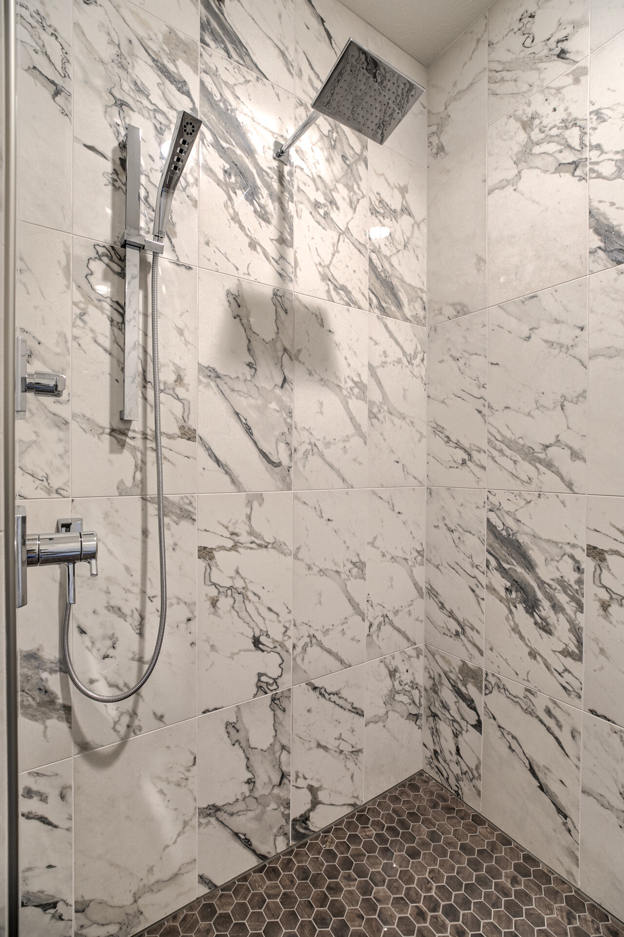
Marble Look Without the Maintenance
Want to create a custom marble look without the expense of marble? This tile product made in Spain and sold by Omaha based vendor Premier Tile is the ticket. It’s called Conde and not only is it more cost effective but the white with gray veining is rich and elegant. It also doesn’t have the same upkeep as real stone which made it optimal to use in our Organic Modern model to make the master bath shower a spa like experience. We complimented it with octagonal mosaic tile on the floor and high-end fixtures to finish off the space.
Colors and Shapes
This triangle configuration was created with four separate tiles in different gray colors. It’s an accent tile combined with subway tile for a pretty contrast sold by Premier Tile. We chose this geometric design to make our Prairie Zen model Jack and Jill bath stand out as a unique yet stylish design. It matches the Zen yet modern them in this house and is soft despite the hard-edged shapes. The color of course is muted so as not to cause too much chaos and to accent rather than be the center of the bath plan. It pops without overwhelming which is what I was going for in this space.

Want to know more about these models and other new construction? Go to www.omahaprioritygroup.com
They refer to the 2021 colors as the “Rhythm of Color”. I love the way they worded that because they truly have a rhythm. They also did something very interesting with the colors and they created a collection of forty hues across four pallets and called them Colormix. An entertaining way to help us feel the colors they’ve chosen for the new year. Join me as we take an expressive dive into these new color pallets and explore how they can all be used in designs for your home.
Sanctuary
It’s referred to as a back to nature kind of experience. Bringing nature inside of course. This pallet includes Pure White, Bona Fide Beige, Pearl Gray, Morris Room Grey, Oakmoss, Antiquarian Brown, Modern Gray, Messenger Bag, Canyon Clay and Urbane Bronze. All of these colors are earth tones and create a feeling of wellness and calm. The earth tones seem to be making a comeback. They include lighter colors for the trim pieces in your home like Pure White as well as bolder and darker colors for accent walls such as Urbane Bronze. One of the colors I’m liking is Oakmoss. It’s a kin to an army green but a bit brighter. This one would be great to put on the walls of a cute little book nook or inside of some book shelves.

Encounter
This pallet includes Alabaster, Reddened Earth, Blustery Sky, Tarnished Trumpet, Jubilee, Natural Tan, Rosemary, Java, Hardware and Navel. It has some nice earth tones as well but more in the darker family of paints including Naval, which is a rich, dark blue color that seems to be remaining popular for the last few years and into the new year. Naval combined with Jubilee (a gray blue color) would certainly make a nice combination for a young boy’s room. Especially if you’re going for that nautical feel. Another fun color in this group is a little bit of a throwback called Tarnished Trumpet. It’s a play on the gold colors that are popular in small accents like kitchen cabinet pulls and lighting. Using this color to play on one of those metal accents in a room would be an interesting way to tie them all together.

Continuum
The Sherwin Williams web site describes this combo of colors as. “An Ethereal Spectrum” and when you look at what’s included, you will agree. Mainly because of Novel Lilac which is a bright star in this group. All the colors grouped here are High Reflective White, Limon Fresco, Commodore, Wishful Blue, Novel Lilac, Moonraker, Swimming, Crushed Ice, Great Falls and Cyberspace. As you can see, they all have interesting names. I’m in love with Novel Lilac. It’s a fun light purple that could easily be used in a nursery or in a young girl’s room to brighten it up but it’s not obnoxious like some colors in this family can be. Paired with High Reflective White for the trim and you’ve got a whole room of happiness.

Tapestry
Contrasting colors in this pallet are beautiful. Peaches and pinks with blues and, believe it or not, black. All with the same underlying hues simultaneously blending them together. The colors in this one are Greek Villa, Aleutian, Enjoyable Yellow, Jovial, Jaipur Pink, Embellished Blue, Perfect Periwinkle, Alexandrite, Cape Verde and Tricorn Black. You can pair many of these colors to make a room soft or bold or, like I said, create a beautiful contrast. The colors that I like the best together are Greek Villa, which is a creamy white, and Tricorn Black for an accent wall. They create a modern, curated look which is very intentional.


Check out this Rhythm of Color for yourself at https://www.swcolorforecast.com/wp-content/uploads/2020/07/SW.Colormix.2021.pdf and for more information on the Priority Group, including our latest blogs, go to www.omahaprioritygroup.com.
Just like clothing fashion, there are fashionable colors as well. Take for instance Benjamin Moore’s new picks for the year 2021. They come in many hues on many places in the spectrum, but these new colors really reflect home and give you a sense of comfort. Benjamin Moore has named Agean Teal, Gray Cashmere, Atrium White, Muslin, Foggy Morning, Amazon Soil, Silhouette, Kingsport Gray, Beacon Hill Damask, Chestertown Buff, Potters Clay and Rosy Peach, its colors of next year. They’re all gorgeous and I have some fabulous suggestions on how to use these colors in your home. Don’t worry…we’re not going to write an essay on color. I picked a few of my favs and I’m going to highlight them. It’s better than watching paint dry.

Aegean Teal

This one is in the lighter teal family and it’s fantastic. I personally think that it makes for a great accent color like on one wall, inside a coffered ceiling, inside some bookshelves or on a kitchen island as a contrast to white cabinets. You could definitely go bold and paint the entire room in Aegean Teal because it’s just soft enough. This color gives you a comfortable country feel while still brightening up the space. It’s a real, at home, type of color.

Silhouette
Aside from having a cool name, and being my fav, this pick has a beautiful deep, dark brown hue with just a hint of gray. Using this on an accent wall would also be exquisite but I prefer to make a statement and paint an entire room with this luscious color. It makes the room feel cozy and if you trim the room in a white or cream color like Atrium White the space still stays open. I would do this in a larger room or even in a sweet little book nook. The great thing about it is that you can use brighter colors or whites in furniture and art to contrast this dark color creating a beautiful pop.
Foggy Morning

The name of this color is spot on. It reminds me of a foggy morning on a beautiful summer day with just the tiniest bit of pink in it. This choice would be excellent for a little girl’s room and lately the trend is to paint larger spaces like a master bedroom in this type of color. My choice would be to use it to make a space a bit more feminine. This color would also go well with in a bathroom with a Carrera marble countertop or even on the bathroom vanity to make a statement. Pair it with Atrium White for a lovely, bright appearance that will give you a fresh, clean look and spa like feel.

Rosy Peach
This one speaks for itself and the name speaks for itself. The best way I can describe it is peach with a rose spice to it. I could see this color on a large accent wall that draws the eye or perhaps as an all over color in a small sitting room. I say that because it has a comfortable, almost boho feeling to it. You could pair it nicely with white and use throw pillows with a hint of gold or cream to match. This color makes a great statement while still being demur.
Check out our video to learn more about all the beautiful Benjamin Moore 2021 colors and go to omahaprioritygroup.com for more information about the Priority Group.
©2020 BHH Affiliates, LLC. An independently operated subsidiary of HomeServices of America, Inc., a Berkshire Hathaway affiliate, and a franchisee of BHH Affiliates, LLC. Berkshire Hathaway HomeServices and the Berkshire Hathaway HomeServices symbol are registered service marks of HomeServices of America, Inc.® Equal Housing Opportunity.
Copyright © 2020 Berkshire Hathaway Home Services Ambassador Real Estate. All rights reserved.
IDX information is provided exclusively for consumers’ personal, non-commercial use, that it may not be used for any purpose other than to identify prospective properties consumers may be interested in purchasing, and that the data is deemed reliable but is not guaranteed accurate by the MLS.


